In today’s digital and technology-driven world, we are constantly consuming vast amounts of media. With large amounts of information available, well-designed infographics work as effective tools to educate or persuade readers about information and trends. An infographic is a visual representation of information. The main purpose is to help readers easily absorb complex data. Recently, I came across three infographics that allowed me to understand streaming habits, media ownership, and TV consumption behaviors in a clear way. Each one stood out for its design, storytelling skills, and clarity.
Infographic 1: “Remote Control: Who Owns What You Watch on TV?”
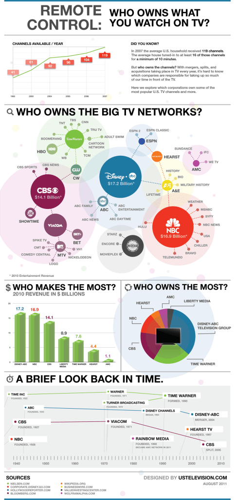
This infographic is structured effectively through representing a clear flow of information. Visual aspects were perfectly picked and represent the data in an organized way that is easy to digest. The sizing was done well and it is easy to read all the data points. One of its strengths is contrasting the text effectively with the background, allowing for figures to be easily understood. Additionally, the choice of selecting distinct colors for the different networks clarifies and separates the networks. The story with the data is told well with the diverse information provided and the main informative goal is clear.
Infographic 2: “How America Is Watching Television”
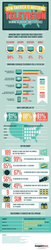
The visual elements of this infographic were perfectly selected and fit to the theme. The categorized sections of viewing habits, demographic differences, and TV service trends is a simple technique that allows readers to absorb the information effectively. The clear distinction between the categories helps guide readers. Using bolded elements for key statistics and percentage values emphasizes the information and makes it pop. Although this infographic is text heavy, the spacing is balanced and allows clear understanding. Sticking to a few colors made the design flow well and visually appealing. This infographic builds the narrative around the decline of traditional TV while emphasizing the increased screen usage in America.
Infographic 3: “What Cord?”
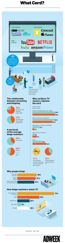
The simplicity of this infographic is what makes it so effective. The 3D visual elements are creative touches and work logically with the data. It is structured into clear sections of streaming service preferences, bing-watching habits, and motivations so you are not overwhelmed with information. The illustrations and charts make the infographic engaging and skimmable. With visuals dominating, the use of text is balanced and makes the main message clear. This infographic displays the story of the decline of cordless TV viewing and the rise of binge-watching streaming services.
Each of these infographics successfully displays data by combining visual hierarchy, effective color schemes, readable typography, and visually appealing elements. By utilizing these techniques, complex information is easy to engage and understand for readers.
Sources:
https://www.mediaculture.com/insights/how-america-is-watching-tv-infographic
https://www.adweek.com/convergent-tv/infographic-how-streaming-is-changing-tv-as-we-know-it/

Leave a comment